How to Build a Stellar SpaceX Presentation: Pro Tips
When you’re trying to convey the ambition behind rockets, reusability, and the future of interplanetary travel, a polished SpaceX presentation can be the difference between a bored boardroom and a room buzzing with ideas. Whether you’re briefing investors, training engineers, or captivating a public audience, the core challenge is the same: translate cutting‑edge technology into a story that sticks. Below is a step‑by‑step guide that blends design savvy with aerospace nuance.
Know Your Audience—and Their Level of Technical Comfort
Even the most dazzling slide deck will fall flat if it doesn’t speak the listener’s language. Start by asking three simple questions: Who will be in the room? What do they already know about launch vehicles? What decision or action do you want them to take after the talk? For an investor panel, focus on market potential, cost per launch, and competitive advantage. For an engineering team, dive deeper into thrust vectors, thermal protection, and iterative testing cycles. Tailor the depth of each section to match the audience’s baseline knowledge.
Design Principles That Echo SpaceX’s Aesthetic
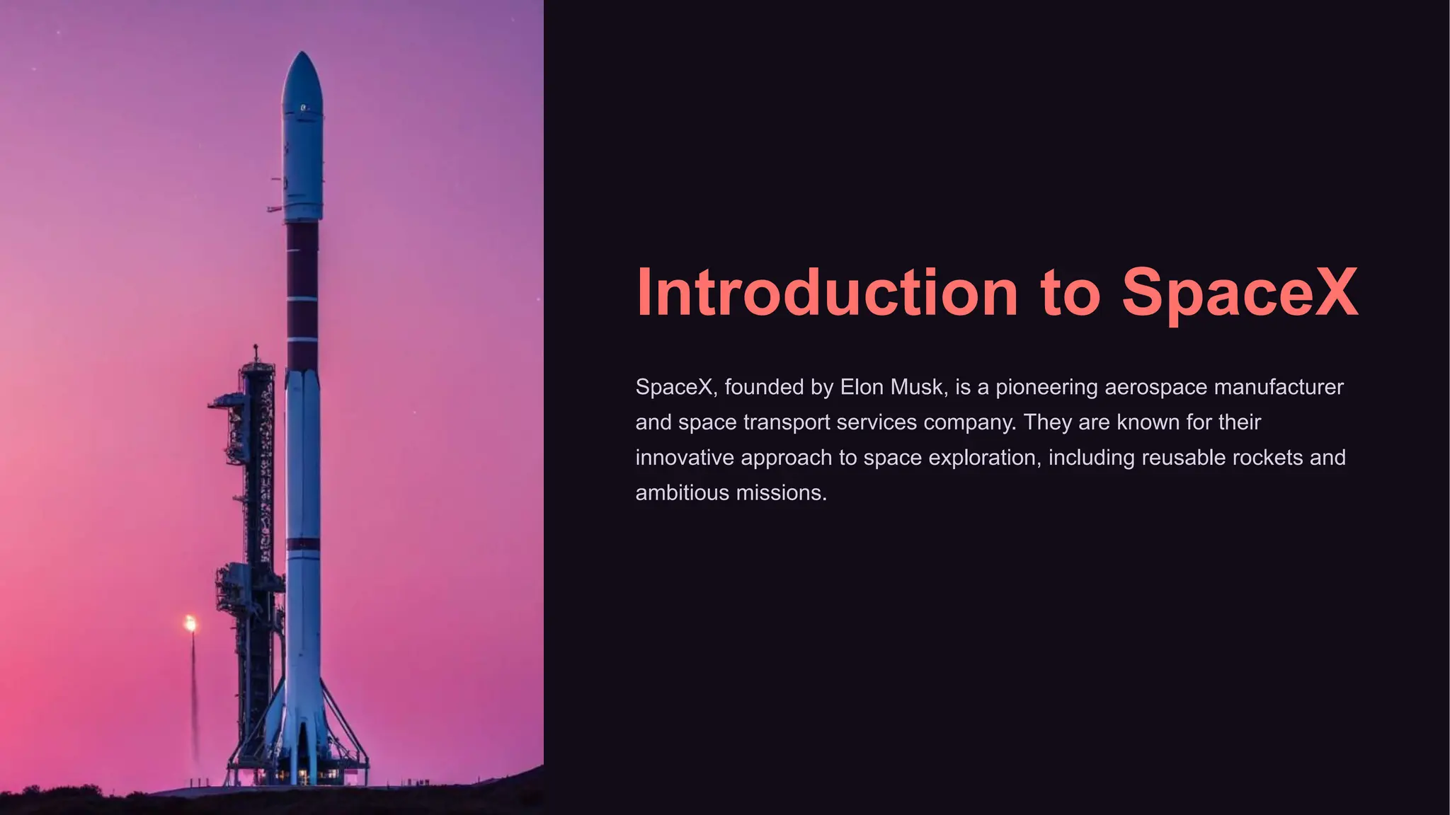
SpaceX’s visual identity leans toward sleek minimalism—think dark backgrounds, bold sans‑serif fonts, and high‑resolution imagery of rockets against star‑filled skies. Adopt these guidelines without copying proprietary assets:
- Contrast is king. Dark canvases make bright launch photos pop.
- Limit text. Aim for no more than six words per bullet; let visuals do the talking.
- Consistent color palette. Use SpaceX’s signature teal, white, and charcoal, reserving accent colors for key data points.
- White space matters. Give each element breathing room to avoid visual overload.
When you apply these rules, the deck feels like a mission control console—clean, functional, and awe‑inspiring.
Structure the Narrative Around the Rocket’s Journey
Humans love stories, and a rocket’s flight provides a built‑in plot arc: ignition, ascent, stage separation, orbit, and return. Map your sections to these milestones:
- Launch Prep: Set the stage with market context and mission objectives.
- First Stage: Highlight early achievements—Falcon 9’s first landing, for example.
- Mid‑Course Corrections: Discuss challenges like engine throttling or supply‑chain hurdles and how they were solved.
- Re‑Entry & Recovery: Showcase sustainability metrics and cost savings.
- Future Trajectory: Introduce Starship, Mars colonization plans, and long‑term ROI.
This progression not only mirrors the technical process but also keeps listeners emotionally engaged.
Data Visualization That Tells, Not Confuses
Charts are inevitable, but they must be purposeful. Instead of a dense spreadsheet of launch costs, use a simple line graph to illustrate the downward trend of cost per kilogram since 2015. Pair that with a short annotation—“Reusability reduced launch cost by 30% in five years.” If you need to compare payload capacities across vehicles, a stacked bar chart with clear legends works better than a table of numbers.
Remember the “less is more” rule: one visual per slide, and each visual should answer a single question.
Polish the Delivery: Rehearsal, Timing, and Tech Checks
Even the best slides can be undermined by a shaky presenter. Schedule at least two dry runs: one with a trusted colleague who can flag jargon, and another in the actual room (or virtual platform) to test lighting, clicker latency, and audio quality. Time yourself; a typical pitch to investors should stay under 15 minutes, leaving ample room for Q&A. If you’re using live video of a launch, preload the clip and verify that it plays smoothly without buffering.
Common Pitfalls and How to Dodge Them
Even seasoned presenters stumble. Here are three traps that often trip up SpaceX decks:
- Over‑technical language. Swap “specific impulse” for “fuel efficiency” when talking to non‑engineers.
- Static slides. Sprinkle in short video loops of a booster landing—movement keeps eyes on the screen.
- Ignoring risk. Glossing over challenges can erode credibility; acknowledge them and outline mitigation steps.
Addressing these early saves embarrassment and builds trust.
Final Touches: Branding, Handouts, and Follow‑Up
End each presentation with a clean slide that features the SpaceX logo (or your organization’s branding if you’re a partner), your contact info, and a concise call‑to‑action—whether it’s scheduling a deeper technical session or reviewing a financial model. Provide a one‑page PDF recap that mirrors the slide’s visual style; it reinforces key points and offers a tangible takeaway.
FAQ
Q: How many slides should a typical SpaceX pitch contain?
A: Most effective pitches range between 10 and 15 slides—enough to cover the story arc without overwhelming the audience.
Q: Is it better to use real launch footage or renderings?
A: Real footage adds authenticity, but high‑quality renderings work well when illustrating future concepts like Starship missions that haven’t yet launched.
Q: Should I include detailed engineering specs?
A: Only if your audience consists of engineers or technical investors; otherwise, summarize performance metrics in plain language.
Q: How can I make my deck stand out in a crowded investor meeting?
A: Focus on a single compelling metric—such as “30% cost reduction per launch”—and build the narrative around that data point, reinforcing it with visual proof.